
Stencils, shine, and die cuts. (AKA: Final Challenge)
Many of my recent posts have been focused on my journey through the Altenew Educator Certification Program. For my final challenge in level one, I was asked to create a birthday, graduation or encouragement card, and either a masculine card or one appropriate for a teenager. I had to choose 3 components from the Level 1 classes to use in these cards. The 3 components I focused on were stenciling, die cutting, and adding shimmer and shine.
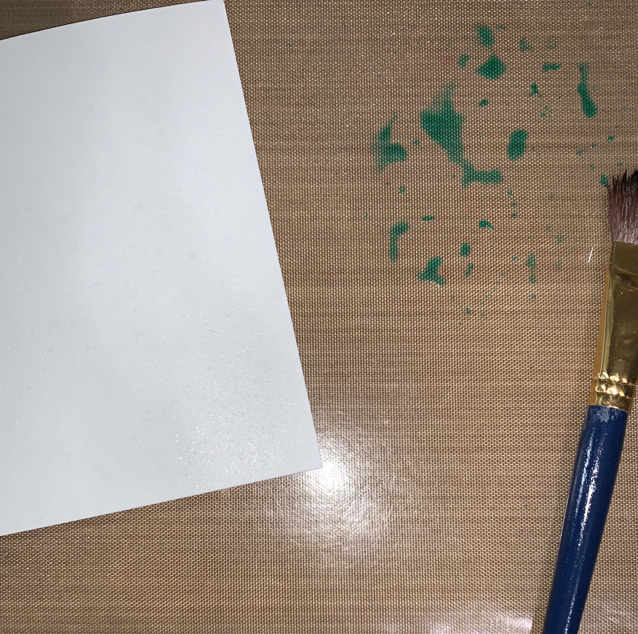
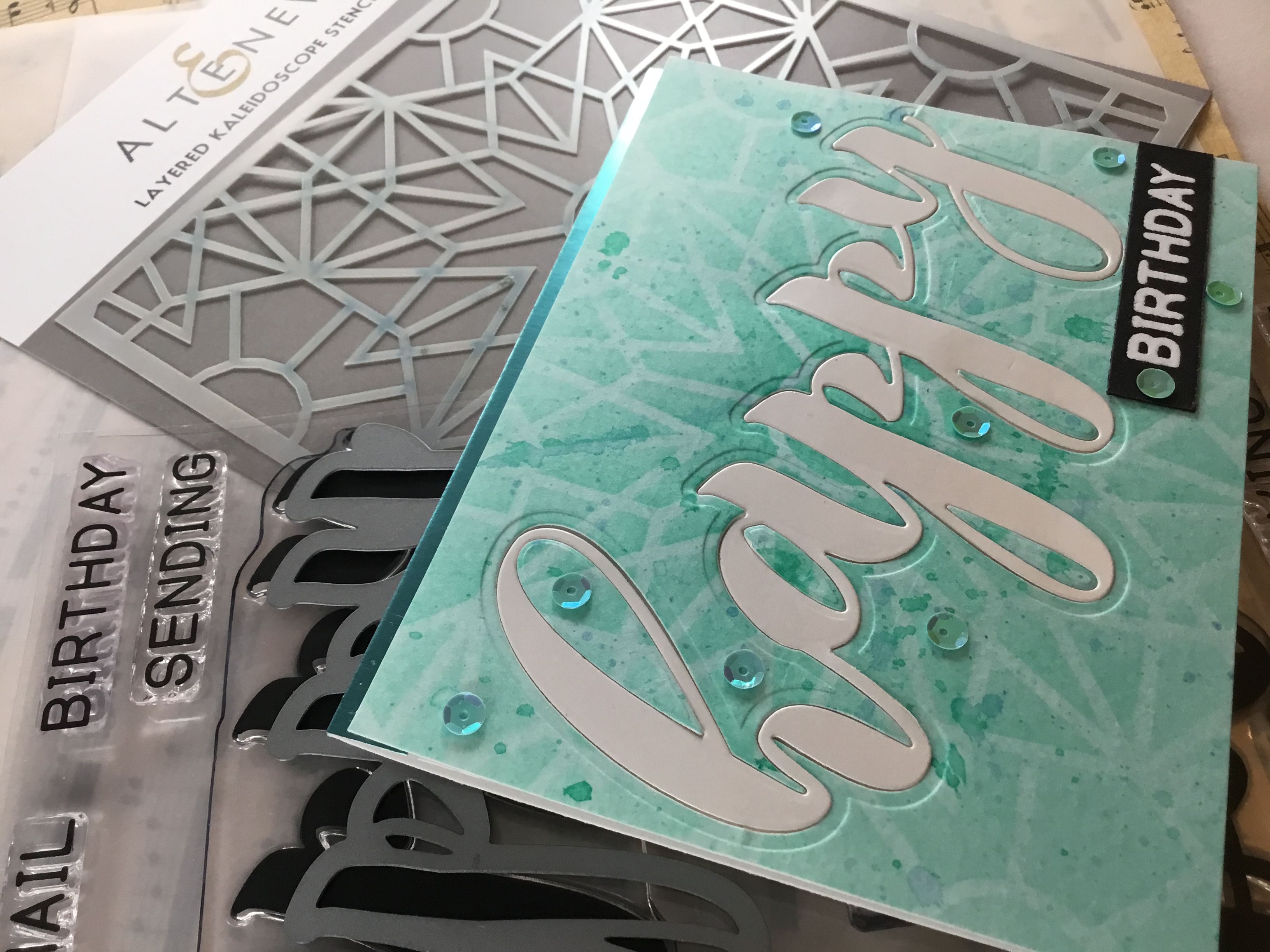
For my first card, I spritzed a 4.5 x 6″ piece of strathmore cold press watercolor paper generously with water. I water colored the card front, first applying a layer of volcano lake ink, then adding persian blue ink toward the center to add some depth. I allowed this to dry, then repeated the process to gain a little more intensity in color, and added some ink splatters.
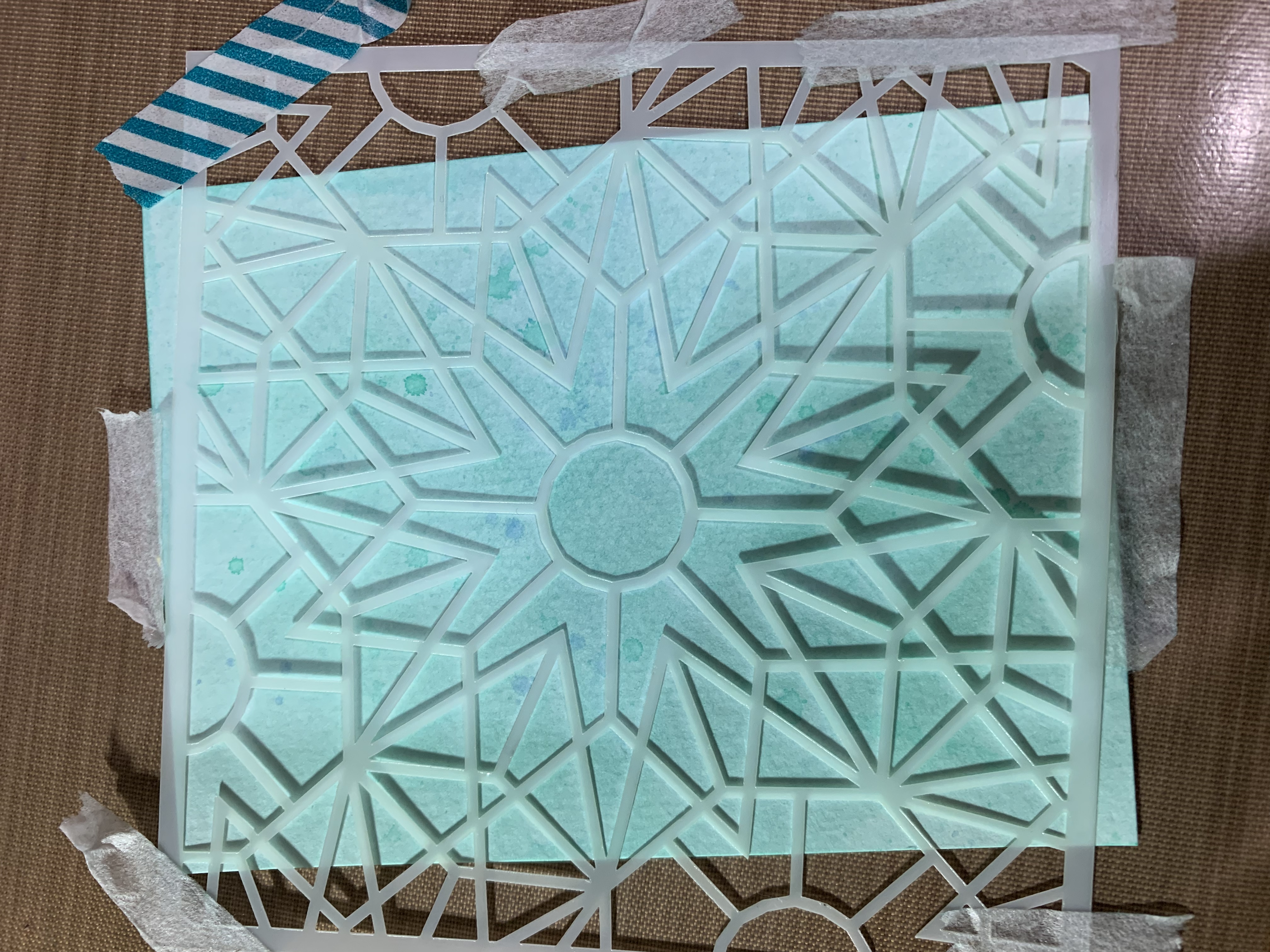
After this dried, I then took the A layer of my Altenew Kaleidoscope stencils and taped it over the “water colored” card stock. Using my clarity stencil brushes, I blended volcano lake and persian blue inks over the card stock, with the deeper blue more toward the center of the stencil.
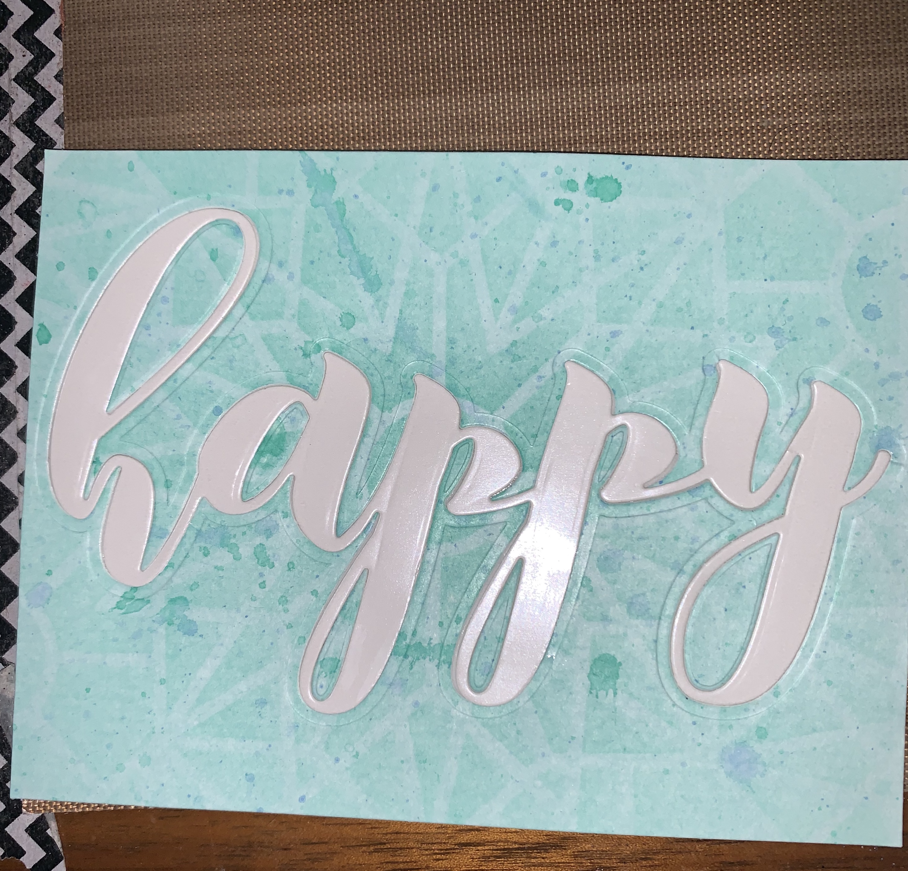
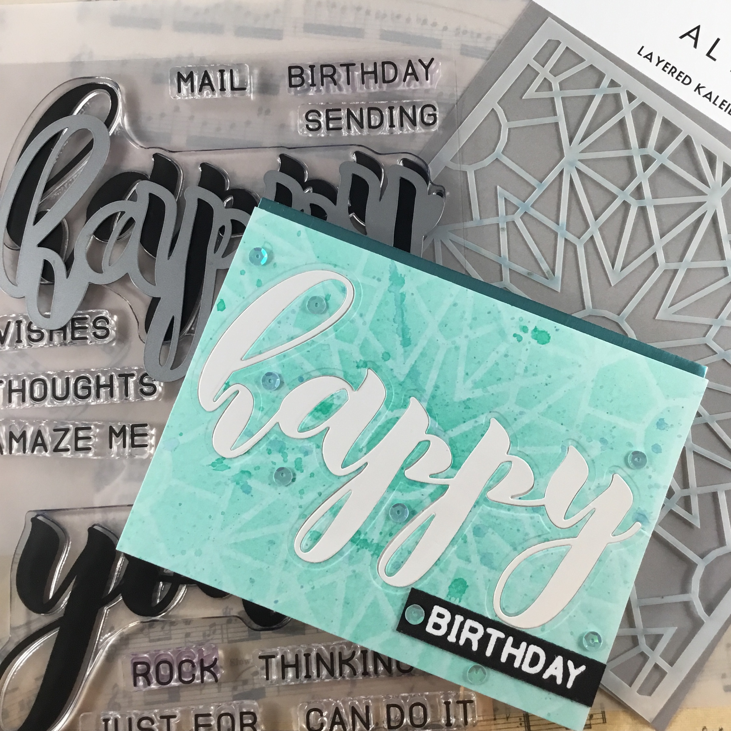
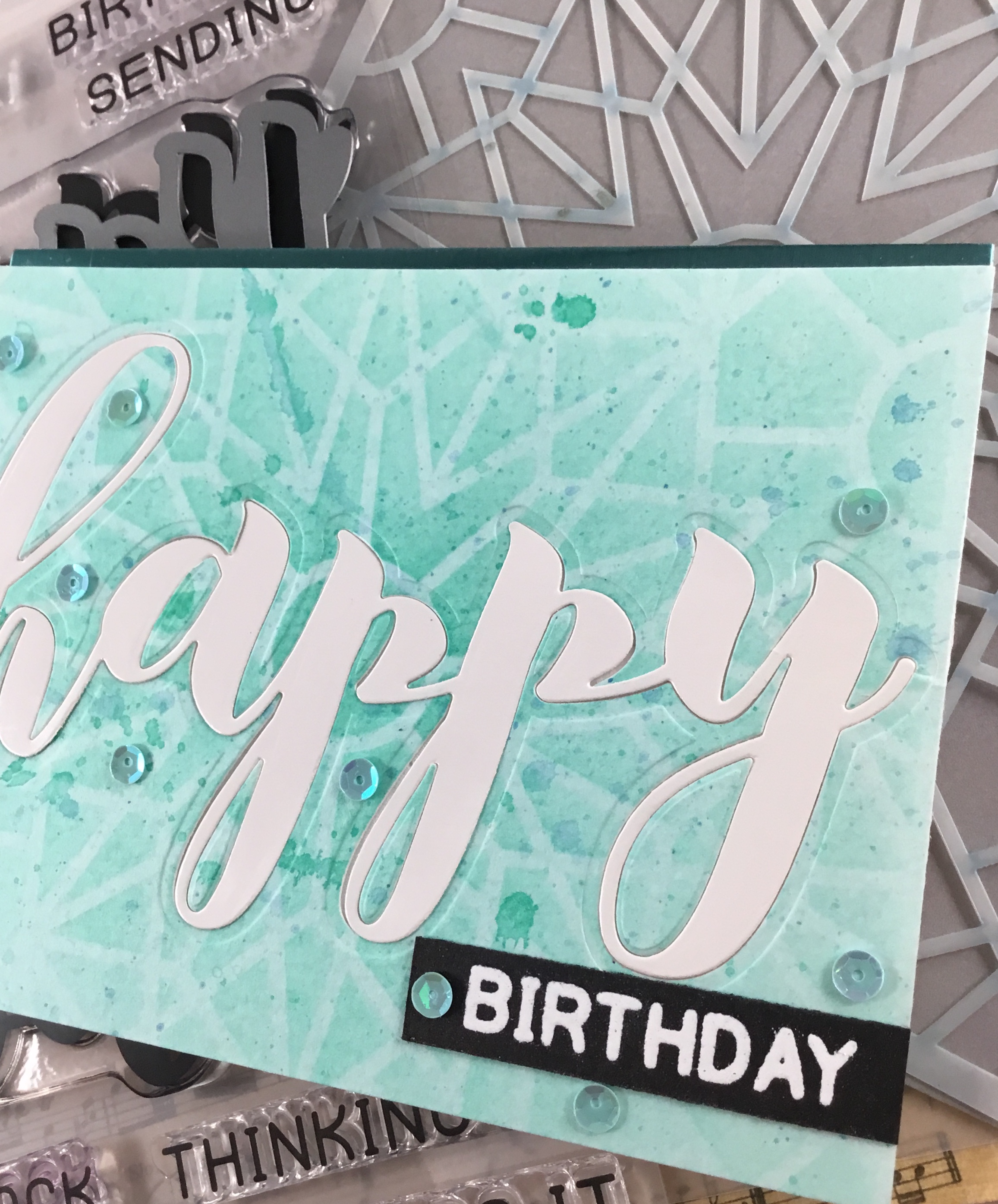
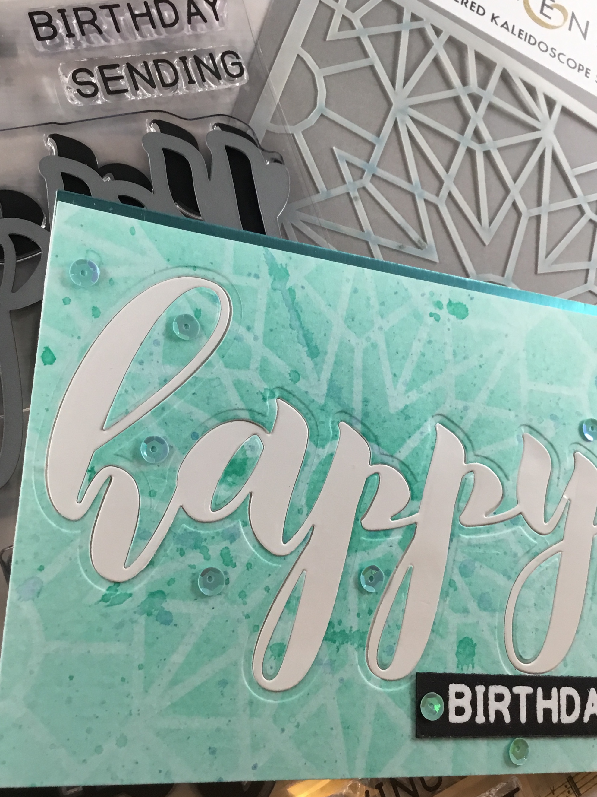
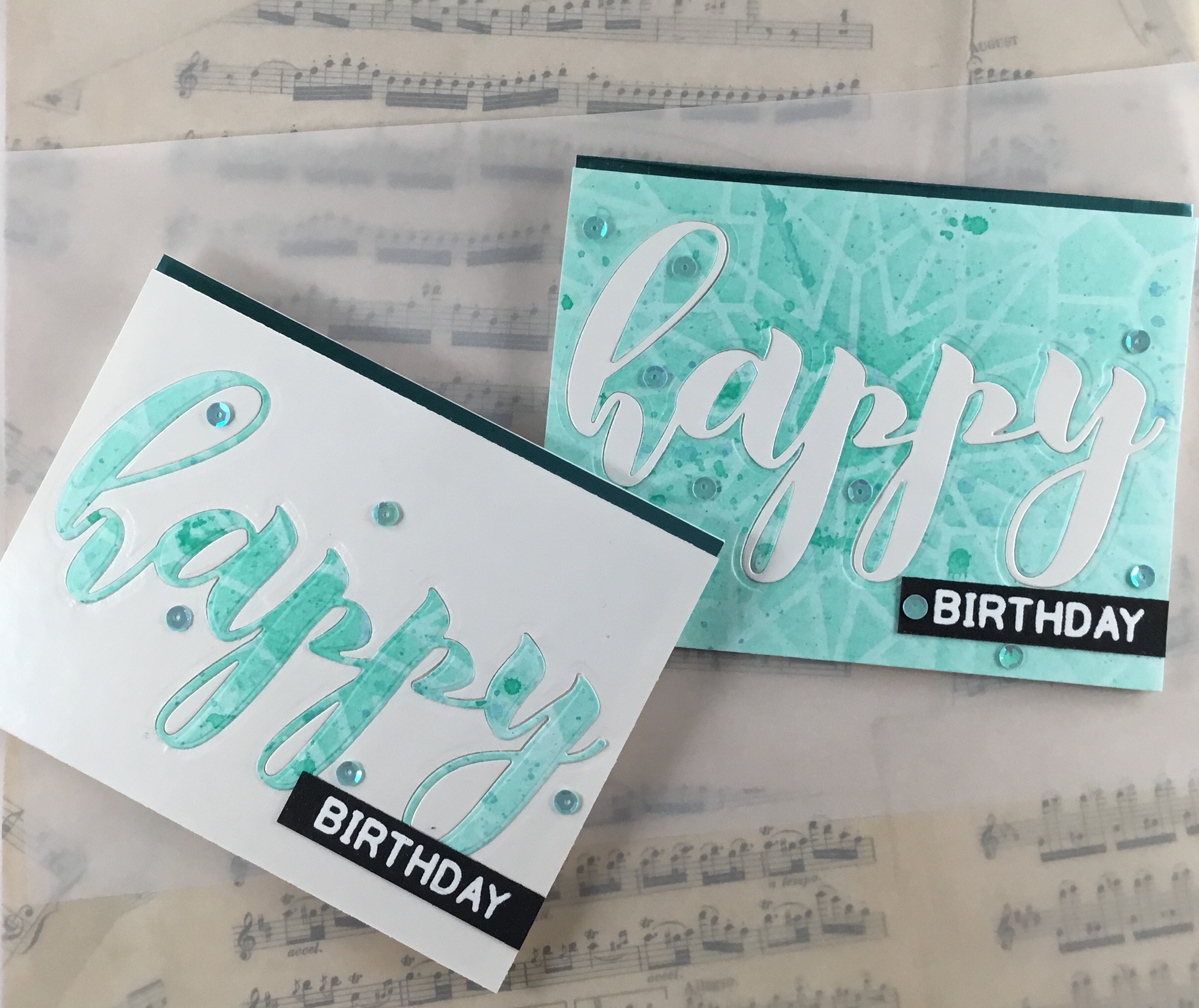
Next, I die cut the word “happy” using my Altenew Mega Greetings 2 stamp and matching die set from both the water colored card stock and a piece of white gloss card stock in my stash. I adhered the water colored card stock on a piece of white craft foam to add some dimension to the entire card. I inserted the white “happy” die cut inside the negative space of the water colored card stock, adding the water colored interior pieces in the loops. I decided to repeat the process with the white gloss card stock that had the negative “happy”, filling it with the water colored “happy” left from the my original card front.
I embossed the sentiment “birthday” (also from the Mega Greetings 2 stamp set) in white (Sparkle ‘n Sprinkle white detail embossing powder) on 2 strips of onyx Gina K Designs card stock. I adhered those on the lower right side of the card front, and added several sequins from a Honey Bee mix that I had on hand. I added a strip of teal metallic card stock along the top edge of a card base I had prepared earlier, and mounted the card front just below the teal strip. Finished! I am including a picture of both the water colored card base with the white die cut, as well as my bonus card that is primarily white. Love it when I can get “two cards out of one”.
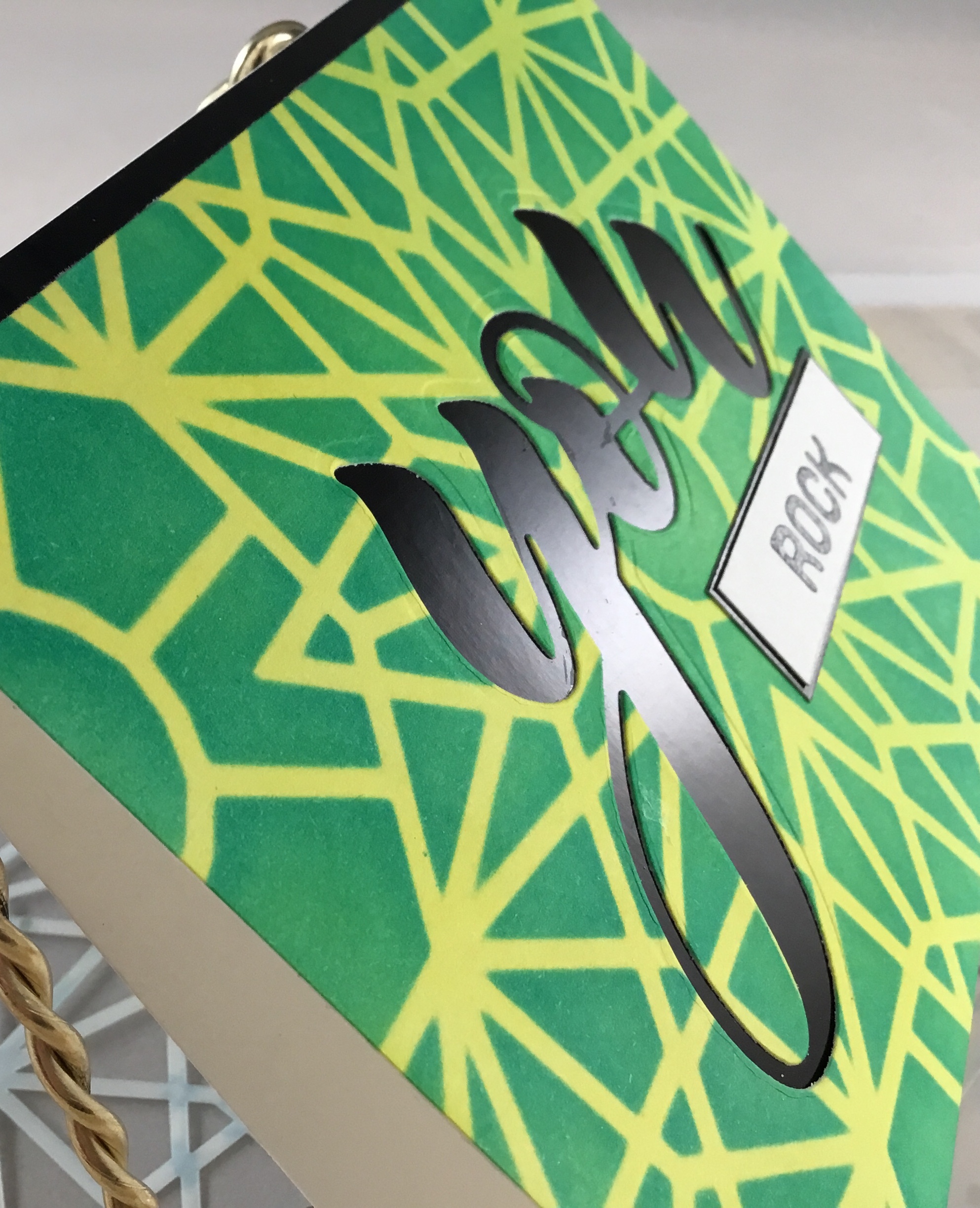
Teenage card makes me think of bold and bright colors and Graphic designs. I had so much fun with my Kaleidoscope stencil, that I decided to continue using the same stencil. I prepped a piece of Neenah Solar White Classic Crest card stock by ink blending squeezed lemonade and twisted citron Distress Ink. This gave me a rather bright background (it is much brighter than it appears in the photo!).
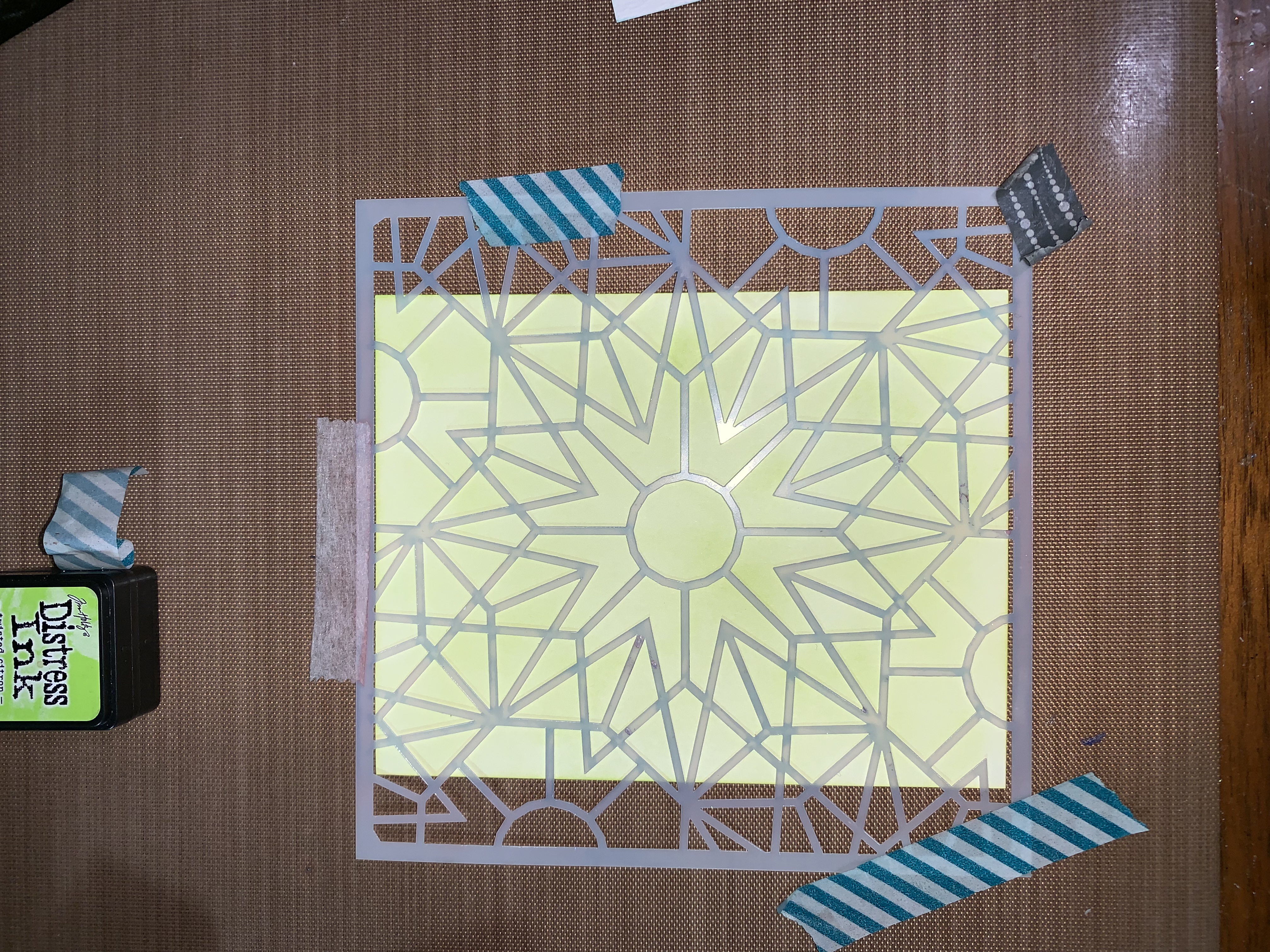
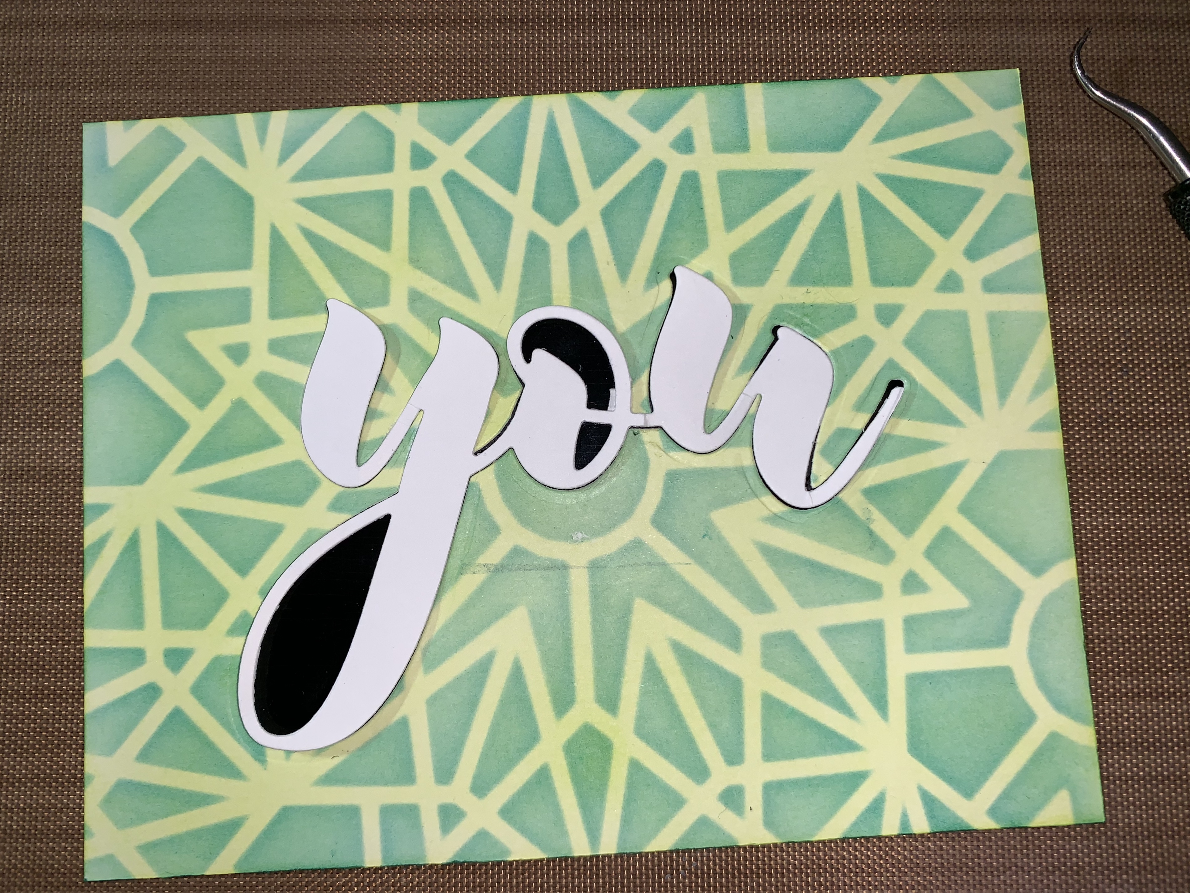
Laying the stencil over it, I taped it down the edges so it wouldn’t move. I blended abandoned coral distress ink over the lemonade and twisted citron. I was a little unsure of how this would come out….but when I lifted the stencil, I was in love with the sunny design that it resulted in! However, I wasn’t sold on this color combo for my final project. I decided to try a different ink on top. So I repeated the whole process, then used peacock feathers for the top layer of color. Again, I loved the results, but still wasn’t sold on this combination. Back to the craft mat I went, and repeated the whole process, using mermaid lagoon on top this time. The reveal showed a very vivid green and yellow design: bingo! Exactly what I was hoping for: something very bright and not too young (and boy, as my personal added challenge was male teenager).
Using the Mega Greetings 2 set again, I die cut the word “you” out of the bright green and yellow card stock, and out of a piece of plain white card stock. I backed the card front with a piece of black gloss card stock from my stash, to add some shine without making it too fussy. I then adhered the interior of the “y” and the “o” into place. Tip: I used the plain white “you” as a place holder inside the negative space, then I adhered the little interior pieces, and gently removed the plain white you from the card front. Works like magic!
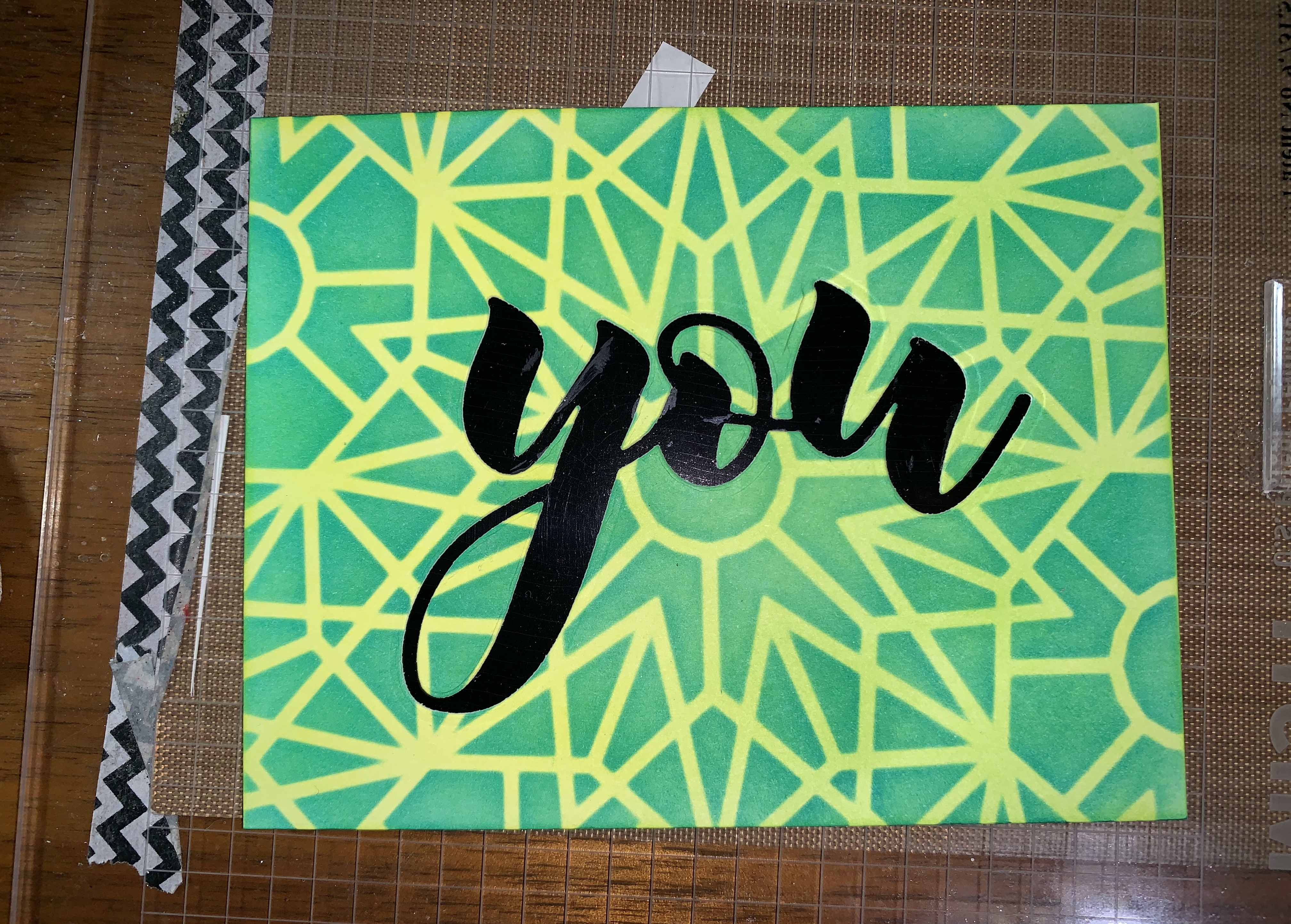
I stamped the word “rock” using jet black crisp dye ink on a strip of white card stack, then heat embossed it with clear embossing powder to add some shine. I adhered the sentiment strip to a slightly larger strip of the gloss black card stock. On a prepared card base, I added a thin strip of the gloss black card stock, then mounted the finished card front. All done! I actually finished the other two card fronts at the same time, and will write about those in a later post.
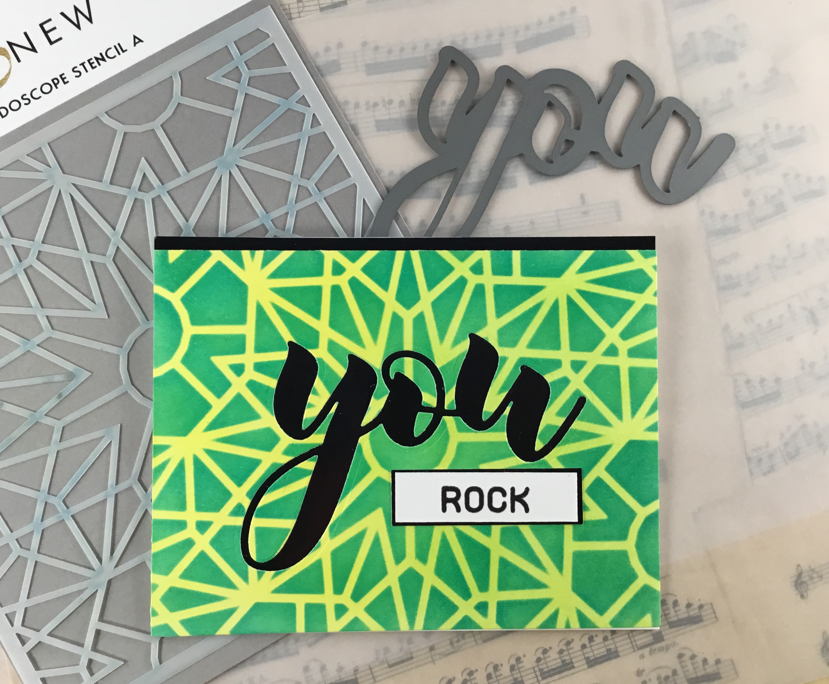
Inspiration: My set of kaleidoscope stencils I couldn’t wait to use, along with the energy that comes from being close to finishing a goal.
I have really enjoyed my level 1 classes, and look forward to starting my level 2 classes. It has been fun to look back at my progress!
As always, thank you for stopping by, and I hope this inspires you to go out and create something!


2 Comments
Virginia L.
Wonderful creations with your stenciled designs! I like how all three were similar but yet different. GREAT job with the write-up and share of photos! Moving forward, I ‘d love to see how you can changed up the layout and design in a more thoughtful and advanced level. I am so glad that you enter your beautiful work in Altenew AECP assignment Gallery. Awesome details and design! Super work!
Erum Tasneem
You did such a wonderful job. I love the simplicity and the vibrancy of the designs though I would encourage you to change the layout or card style when using the same products so that they look different.
Thank you for submitting your gorgeous creations to the AECP gallery. Well done!