All about layering (stamps)…1
Two of the classes I need to complete my Altenew Level one certification are about using layering stamps. These classes have really helped my confidence in lining up the stamps and getting clean stamped images. Today I will focus on the first class.
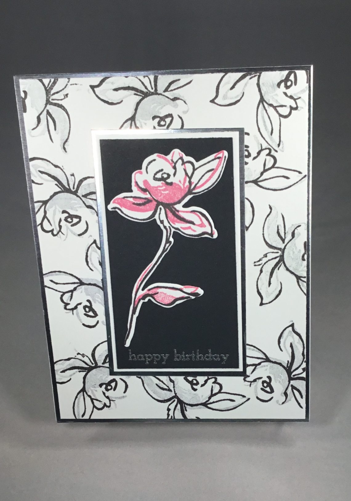
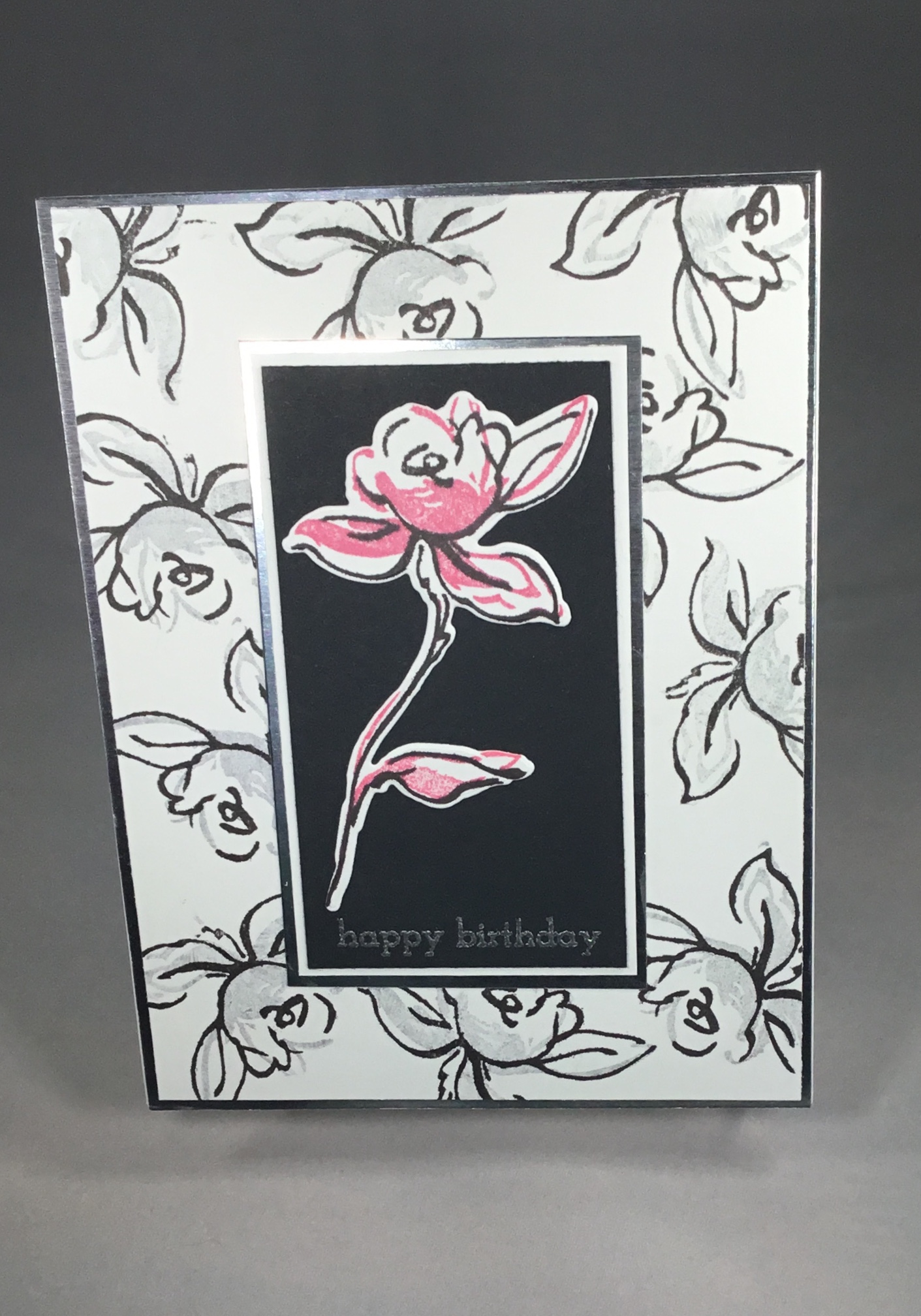
I used the Golden Garden stamp set for my project for this class. I really love this stamp set as it is easy to line up, and pretty forgiving if you don’t get it perfect! I also really like the variety in this set: there are images that can be focal points, and lots of options to create a background!
I have lately been really motivated to create a patterned background and die cut a sentiment from it and popping it up from the stamped background. I also love backgrounds made from a repeated image in muted colors , with the same image stamped in a bright color to create a focal piece.
I love both of these cards for different reasons.
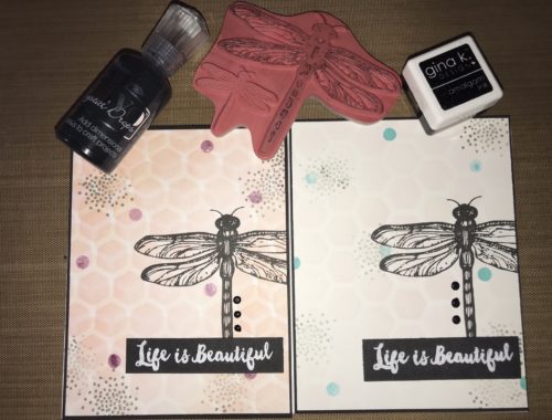
For one card, I choose the large rose on a stem as my focal point. I masked off the stem, and stamped the outline repeatedly in jet black crisp dye ink. I then used Hero Arts soft granite ink to fill in the images. From there, I stamped the full image on a separate piece of card stock, then used coral berry to fill it in, and used the matching die to cut it out.
Using my Gina K black onyx card stock, I stamped the sentiment happy birthday (from Altenew’s Super script stamp set) in versa mark, then embossed it with silver embossing powder (sparkle ‘n sprinkle). I went a little mounting crazy then….I mounted the black card stock on white, then on silver mirror card stock. That whole stack went on the black and grey stamped background, which I then mounted on more silver mirror card stock before mounting it on my card base. Done. I love the grey and black with the pop of color. The several layers of card stock probably takes this a bit beyond clean and simple, but oh well!
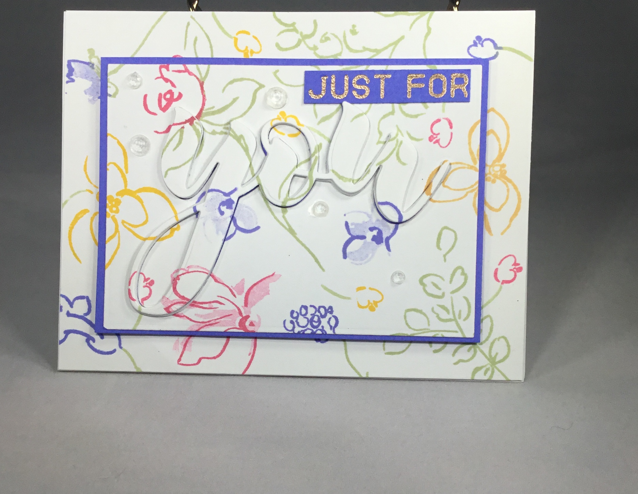
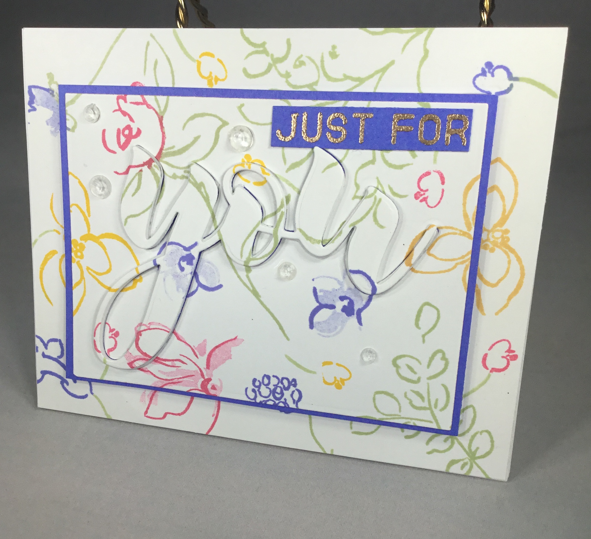
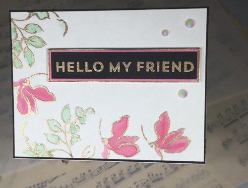
However, the card that really challenged me and pushed me outside of my limits was the card pictured below! I stamped the background quite randomly, using frayed leaf, coral berry, and pink frost Altenew inks and Gina K’s Wild Wisteria and Wild Dandelion. I left it for a few days, then came back in and added a few more of the smallest flower images. For this background, I generally masked off the flower image and stamped the stem in frayed leaf, then masked off the stem and stamped the flower in a color. Using a rectangle die from my Spellbinders Venice Lace set, I die cut a frame, then I used the word “you” from my Altenew Mega Greetings 2 set to die cut the center section that was left. I quickly trimmed down a piece of Gina K wild wisteria card stock to slightly larger than the center rectangle and mounted the negative die cut piece on the purple card stock. I then die cut another “you”, this time from craft foam. I adhered the craft foam “you” inside the negative space, securing the inside sections of the y and the o from the floral background inside the foam die cut. I then adhered the floral “you” to the foam “you”. I embossed the words “just for” in Altenew rose gold embossing powder on a small strip of wild wisteria, and adhered that to the card front. To finish off the card, I mounted the floral background frame to the card base, then another piece of craft foam to the card base inside the frame. I adhered the sentiment rectangle on top of the craft foam, and added a few Pretty Pink Posh embellishments to finish it off.
Inspiration? All of the beautiful clean and simple cards in the class, and the many cards I have seen recently with the sentiment die cut from the background that I knew would stretch my comfort zone! I love bright pink/coral with black and white (and grey). I love that pop of color! But I also love the bright floral background I created.
Take aways? Much more confidence in lining up layering stamps. Especially after I finished class two…..my next blog post….stay tuned!
I would love to know which card you liked better of these two! Please comment below, and as always, thank you for reading. I hope this inspires you to go out and create something!


4 Comments
Virginia L.
GREAT post with your first Layering course! I love both renditions and… I am leaning toward the 2nd card more simply because it is more coloring and the use of “dies” is fabulous! I am so glad that you enter your beautiful work in Altenew AECP assignment Gallery. Awesome details and design! Super work! I look forward to seeing more of your lovely work!
admin
Thank you Virginia.
Erum Tasneem
Hi Collette!
Like Virginia, I too like the second card more because of the extra work put into it. The colours you used on both cards are lovely.
Now you are almost at the end of this level so I want you to work on your photography a bit. The first photo of your second card has a good angle compared to the first card photo and the last photo. The first card photo looks as if the card is tipping over, I am guessing it’s because you/your camera was higher than the card. Work on this please, the photos make a lot of difference. Also, try to leave more space between where your project and photo ends. Right now, the project is taking over the whole photo and the eye can’t seem to settle or focus on it. You need that extra space so the eyes have an easier time focusing on the project. If you like to talk a bit more about this, please feel free to email me. I am always here to help you 🙂
Thanks so much for entering your beautiful work in the AECP assignment Gallery. Beautiful colors and design. Well done!
admin
Thank you, Erum. I will be in touch!